A tech brand color palette is the set of primary, secondary, and accent colors a technology company uses across its website, app, and marketing to build recognition and trust. While blue has long dominated tech, 2026 palettes increasingly blend violet, green, and high-contrast neutrals to stand out, signal innovation, and improve conversion rates.
Introduction
Picking a tech brand color palette used to mean one thing: blue, and more blue. But that playbook is fading fast. Founders are now choosing colors for software brands that feel warmer, bolder, and more human. This shift matters because how color psychology affects tech consumers directly shapes whether they trust your product enough to click “sign up.” In this guide, you’ll get real hex codes, accessibility rules, and layout tips so your palette does more than look nice — it converts. [Along with your brand colors, selecting the right domain is crucial. Check out our .ai vs .io domain extension guide for tech startups.]Let’s start with why blue is losing its grip on the industry.
The Psychology Shift: Why Tech Branding is Moving Away from Traditional Blue
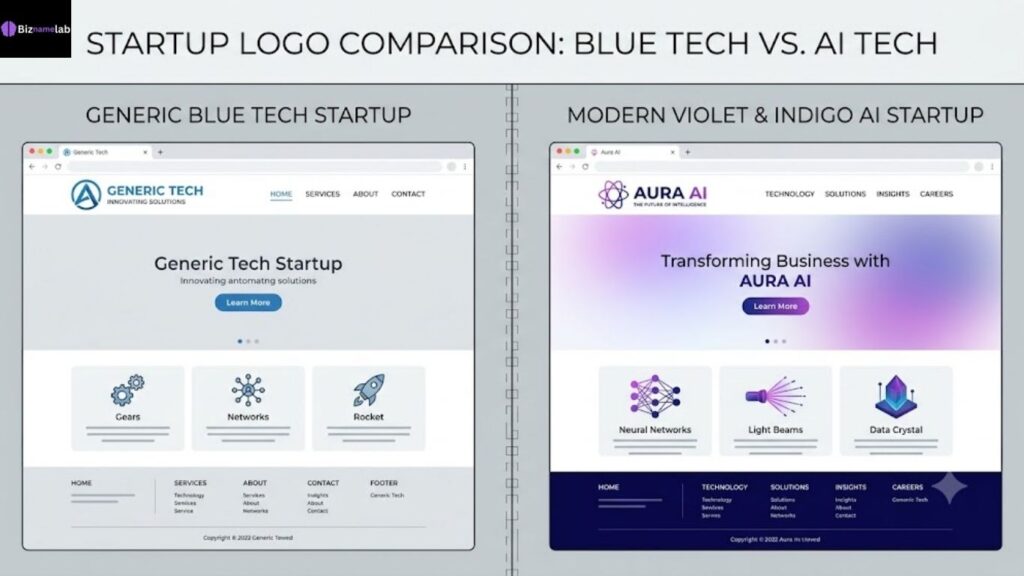
For two decades, blue was the safe choice for every SaaS logo and app icon. It signaled trust, stability, and professionalism, which made sense when the internet still felt new and a little scary. Companies needed to look dependable more than they needed to look different.
That era is ending. Thousands of tech companies now share nearly identical blue logos, so blue no longer helps anyone stand out. Buyers scroll past blue websites without a second glance, because their brains have stopped registering it as distinctive. This is a classic case of branding color schemes losing power through overuse.
Newer companies are responding by building corporate visual identity around unexpected hues. Violet suggests creativity and forward thinking, which is why so many AI startups use it. Green now signals sustainability and calm focus rather than just “go” or money. Understanding why technology companies use violet and green helps explain a lot of the rebrands you’ve seen over the last two years.
This doesn’t mean blue is dead. It means blue alone is no longer a differentiator. Smart founders pair it with a secondary color that carries more personality, or replace it entirely when their product story calls for something bolder.
Quick example: Slack moved from a simple blue-ish logo to a multicolor mark. Stripe leans purple-blue. Notion uses near-black with warm off-white. None of them play it safe with plain corporate blue anymore.
How Colors Influence User Trust and Conversion Rates on Tech Websites
Color isn’t decoration — it’s a signal your brain processes before you’ve even read a word of copy. Visitors form an opinion about a website’s credibility within seconds, and color does a huge share of that heavy lifting. This is the foundation of color emotional trigger in digital marketing.[According to HubSpot’s research on branding, color increases brand recognition by up to 80%.]
Here’s how specific colors tend to be read by USA tech audiences:
| Color | Common Emotional Signal | Best Use Case |
| Blue | Trust, calm, security | Fintech, healthtech, B2B SaaS |
| Green | Growth, sustainability, “go” | Eco-tech, wellness apps, fintech CTAs |
| Violet/Purple | Innovation, creativity, premium | AI tools, creative software |
| Orange | Energy, urgency, friendliness | CTAs, onboarding flows |
| Black/Charcoal | Sophistication, minimalism | Premium SaaS, developer tools |
| Red | Urgency, alerts, passion | Warnings, limited-time offers |
Beyond emotion, color affects measurable behavior. A single accent color used consistently on buttons can lift click-through rates because it creates a predictable visual pattern users learn to trust. This is exactly why high-converting colors for landing pages are usually a single bold accent against a calm, neutral background rather than a rainbow of competing hues.
Practical tip: Pick one accent color for every call-to-action button on your site. Never let it compete with another equally bold color on the same page — the eye should always know where to click next.
Core Elements of a High-Converting Tech Brand Color Palette
A palette isn’t just “pick three colors you like.” A working system has clear roles, and skipping any of them creates inconsistency across your product, website, and marketing.
1. Primary color. This is your brand’s main identity color — used in the logo, headers, and dominant UI elements. It should be recognizable even in black and white silhouette.
2. Secondary color. Supports the primary without competing with it. Often used for backgrounds, secondary buttons, or illustrations.
3. Accent color. Reserved almost exclusively for accent colors for buttons, links, and anything you want users to notice or click.
4. Neutral base. Grays, off-whites, and near-blacks that make up 60-70% of most interfaces. These carry text, cards, and whitespace without fighting for attention.
5. Semantic colors. Fixed colors for success (usually green), error (usually red), and warning (usually amber) states — these should never double as branding colors, or users will misread system feedback.
A good ui ux design color palette documents all five categories with exact hex, RGB, and usage notes inside your brand style guide templates, so every designer and developer applies colors the same way.
The AI & Deep Tech Palette: Hex Codes for Next-Gen Software Startups
AI and deep tech companies want to feel intelligent, futuristic, and slightly mysterious — think less “friendly app,” more “advanced system.” Violet, indigo, and near-black dominate this space, often set against electric accent tones.
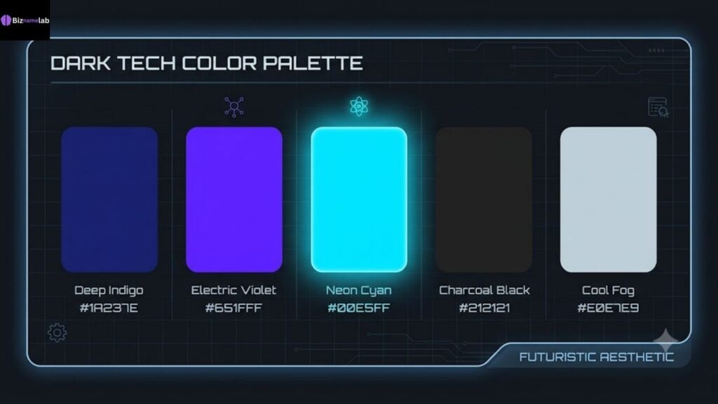
| Role | Color Name | Hex Code |
| Primary | Deep Indigo | #2E1A47 |
| Secondary | Electric Violet | #7B2FF7 |
| Accent | Neon Cyan | #00E5FF |
| Neutral Dark | Charcoal Black | #0D0D14 |
| Neutral Light | Cool Fog | #E6E6F0 |
This is one of the clearest examples of hex codes for tech startup branding built for perceived intelligence rather than warmth. Pairing deep indigo with a single neon accent keeps the palette feeling premium instead of overwhelming, which matters for industry standard tech hex codes used across investor decks, dashboards, and product UI alike.
Where it works best: AI copilots, developer tools, machine learning platforms, and any product where “cutting-edge” is the core promise.
The Clean SaaS Aesthetic: Pastel and Minimalist Color Schemes for 2026
Not every software company wants to feel intense. Productivity tools, note-taking apps, and lightweight SaaS products increasingly reach for soft, breathable palettes that reduce visual fatigue during long work sessions.
| Role | Color Name | Hex Code |
| Primary | Soft Sage | #A8C3A0 |
| Secondary | Warm Sand | #F4EDE4 |
| Accent | Muted Coral | #E8927C |
| Neutral Dark | Slate Gray | #3B3B3B |
| Neutral Light | Cloud White | #FAF9F7 |
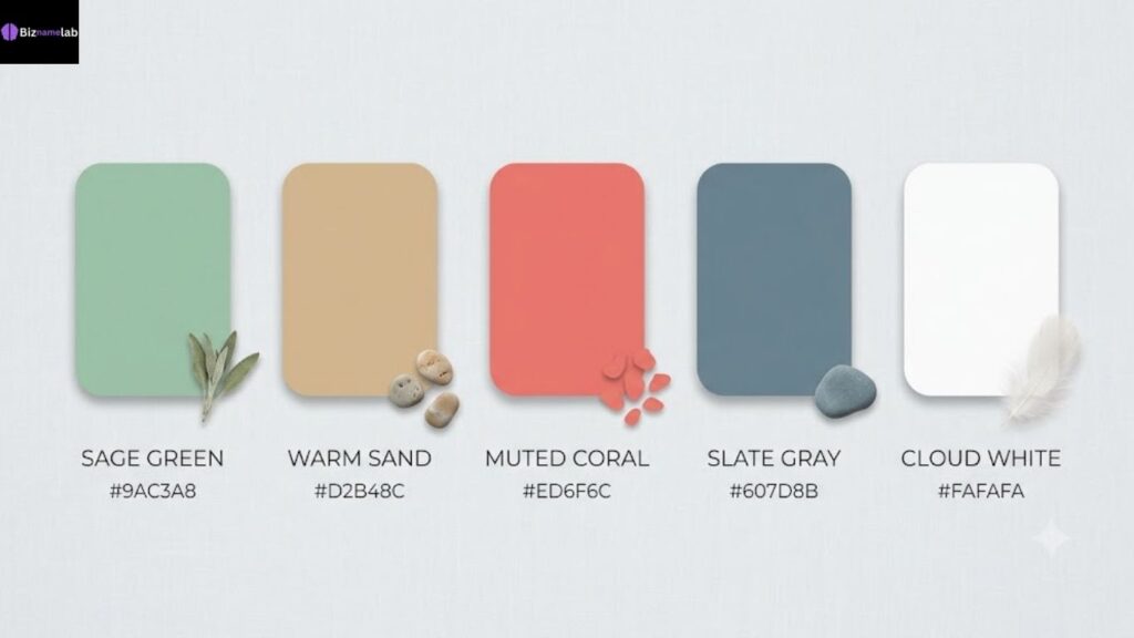
This is the heart of the modern aesthetic for SaaS platforms trend: low-saturation colors, generous whitespace, and one gentle accent for buttons. These are genuinely some of the best minimalist tech colors because they stay calm on screen for hours without straining users’ eyes.
Practical tip: If your product is used daily for long stretches (calendars, docs, task managers), pastel palettes usually outperform saturated ones in user satisfaction surveys, simply because they’re easier to look at repeatedly.
The Eco-Tech & Renewable Energy Palette: Colors for Sustainable Tech
Climate tech, solar platforms, and sustainability-focused startups need colors that feel grounded in nature without looking dated or overly “granola.” The trick is pairing organic greens with modern neutrals instead of the earthy browns of older eco-branding.
| Role | Color Name | Hex Code |
| Primary | Forest Green | #1F5E3D |
| Secondary | Leaf Green | #6CB35C |
| Accent | Sunlight Yellow | #F5C242 |
| Neutral Dark | Deep Slate | #1A2E28 |
| Neutral Light | Mist White | #F0F5F2 |
These software company color palettes work because green does double duty — it reads as both “sustainable” and “financially healthy,” which reassures investors and everyday users at once. A yellow accent nods to solar energy without tipping into cliché.
Where it works best: Solar platforms, EV software, carbon tracking tools, and green fintech apps that want warmth alongside credibility.
The Cyberpunk & Fintech Vibe: High-Contrast Color Codes for Bold Brands
Fintech and Web3 brands often want the opposite of “calm.” They want energy, edge, and a sense that something exciting is happening right now. High-contrast, saturated palettes deliver that without sacrificing usability, as long as they’re applied carefully.
| Role | Color Name | Hex Code |
| Primary | Void Black | #0A0A0A |
| Secondary | Hot Magenta | #FF2E9A |
| Accent | Acid Green | #C6FF00 |
| Neutral Dark | Graphite | #1E1E1E |
| Neutral Light | Bone White | #F5F5F5 |
This is a contrasting color palette built for impact: dark backgrounds make saturated accents pop, which is why so many trading apps and crypto dashboards use near-black UI. Just be careful — this style demands strict discipline, since two loud colors placed side by side can quickly become unreadable rather than exciting.
Practical tip: Use only one loud accent at a time per screen. Let the dark neutral carry 70% of the layout so the bold color still feels special when it appears.
The 60-30-10 Design Rule: How to Apply Colors to Your WordPress & Elementor Layout
Even a perfect palette fails if it’s applied randomly across a page. The 60-30-10 rule is the simplest system for turning any of the palettes above into a balanced, professional layout — especially useful if you’re building in WordPress or Elementor.
- 60% — Dominant/neutral color. This covers backgrounds, sections, and large content areas. It should almost always be your neutral light or dark tone.
- 30% — Secondary color. Used for supporting sections, cards, icons, and secondary buttons throughout the page.
- 10% — Accent color. Reserved strictly for calls-to-action: your “Sign Up,” “Buy Now,” or “Get Started” buttons.
In Elementor specifically, set these three colors as Global Colors under Site Settings first. This keeps your website color combinations consistent across every page and template automatically, instead of manually picking colors section by section.
Practical tip: Audit your homepage once it’s built. If you can’t immediately spot your one accent color within three seconds of loading, your 10% is likely too spread out.
Accessibility in Tech Branding: Choosing Contrast Colors for USA & Global Readers
A beautiful palette that fails accessibility standards isn’t a finished palette — it’s a liability. Roughly 1 in 12 men and 1 in 200 women in the USA have some form of color vision deficiency, and low-contrast text simply excludes them from your product.
The web accessibility contrast guidelines for branding come primarily from WCAG, which recommends a minimum contrast ratio of 4.5:1 for normal text and 3:1 for large text against its background. You can check any color pairing for free using WebAIM’s contrast checker, one of the most trusted resources for accessibility testing.
Checklist for accessible tech branding:
- Test every text/background pairing, not just your primary logo colors.
- Never rely on color alone to convey meaning (e.g., pair red error text with an icon, not just color).
- Check palettes under simulated color blindness modes, available in most design tools.
- Keep body text darker or lighter than a mid-gray midpoint for safe contrast margins.
Building accessibility in from the start is far cheaper than retrofitting it later, and it directly supports better EEAT signals since Google increasingly rewards genuinely usable, inclusive websites.
Common Color Branding Mistakes That Can Ruin Your Startup’s Identity
Even experienced founders make avoidable color mistakes that quietly undermine an otherwise strong brand. Here are the ones seen most often across tech startups.
- Using too many accent colors. More than one bold accent color creates visual noise and confuses users about where to focus or click.
- Ignoring competitor palettes. Choosing a color already dominant in your niche makes it harder for customers to tell brands apart.
- Skipping a documented style guide. Without brand style guide templates, every new hire or freelancer picks slightly different shades over time.
- Choosing color before strategy. Picking colors before defining brand personality leads to a palette that looks nice but says nothing about the product.
- Neglecting dark mode. A palette that hasn’t been tested in dark mode often breaks contrast rules the moment users switch themes.
- Copying trends blindly. Following whatever look is popular this year, without considering whether it fits your actual audience or industry.
Fixing these issues early protects your digital product branding long-term, since a full rebrand later is far more expensive than getting the palette right the first time.
How to Test Your Brand Colors Across Different Devices and Screen Sizes
Colors don’t render identically everywhere. A palette that looks balanced on a calibrated designer monitor can look washed out on a budget Android phone or overly saturated on an OLED display.
Steps to test properly:
- View on real devices, not just browser resizing — test an actual iPhone, an older Android phone, and a Windows laptop.
- Check both light and dark ambient lighting, since screens reflect differently in bright rooms versus dim ones.
- Test dark mode and light mode separately if your product supports both.
- Run contrast checks per device using screenshot tools, since brightness settings can shift how a ratio actually reads.
- Ask five real users unfamiliar with the brand what emotion the palette gives them — their gut reaction reveals more than any internal design review.
This process matters even more for best colors for dynamic mobile apps, since mobile users often view your interface in direct sunlight, low battery “dark” modes, or heavily color-adjusted screen settings that desktop testing never catches.
Key Takeaways
- Blue is no longer a differentiator on its own; pair it with a distinct secondary color or replace it based on your brand story.
- Every palette needs five defined roles: primary, secondary, accent, neutral, and semantic colors.
- Use the 60-30-10 rule to apply colors consistently across your website layout.
- Accessibility (WCAG contrast ratios) isn’t optional — it protects both users and conversions.
- Test your palette across real devices, not just design software previews.
FAQs
What is the best color for a tech brand in 2026?
There’s no single “best” color — it depends on positioning. AI brands lean violet and indigo, SaaS tools lean pastel minimalism, and fintech brands often use high-contrast dark palettes with a bold accent.
Is blue still a good choice for tech branding?
Yes, but it works best today as one part of a larger palette rather than the whole identity, since plain blue logos now blend into a crowded market.
How many colors should a brand palette have?
Most strong tech palettes use five defined colors: one primary, one secondary, one accent, plus a light and dark neutral — enough for consistency without overcomplicating your corporate visual identity.
What contrast ratio do I need for accessible text?
WCAG recommends at least 4.5:1 for normal text and 3:1 for large text against its background color.
Should my logo colors match my website colors exactly?
They should be closely related but don’t need to be identical — your logo can use a slightly richer version of your primary color while your site uses it more sparingly for balance.
Conclusion: Aligning Your Tech Brand Color Palette with the Perfect Business Name
Your tech brand color palette works best when it’s built alongside your name and story, not bolted on afterward. Colors reinforce what your name already promises — a violet palette paired with a name suggesting innovation says something very different than sage green paired with a name suggesting calm productivity. Treat both decisions as one system.
If you’re still shaping your brand’s foundation, start with your name before locking in colors, since the right name gives your entire palette a clearer direction to build around.[If you are ready to find your identity, use our AI Business Name Generator to find the perfect name in 5 seconds.]“