Neon color palettes pair one or two ultra-saturated, glowing hues — like electric blue, hot pink, or lime green — with a dark background to create high contrast and instant visual impact. In 2026, designers use them as accent colors in digital branding, SaaS dashboards, and dark-mode interfaces rather than as full-page backgrounds, since overuse causes eye strain and hurts text readability.
Table of Contents
- What Are Neon Colors and Why Do They Stand Out?
- The Psychology of Neon Color Palettes in Digital Branding
- How to Use Neon Colors Effectively in UI/UX and Web Design
- 15+ Trending Neon Color Palettes (With Names and HEX Codes)
- Common Mistakes to Avoid When Designing with Neon Colors
- Key Takeaways
- FAQs
- Conclusion

Introduction
Neon color palettes are everywhere right now, from SaaS dashboards to Gen Z streetwear brands, and there’s a real reason for it. These glowing, saturated hues grab attention in a crowded feed within seconds. But picking the right combination isn’t random — it’s rooted in color psychology in marketing, visual hierarchy, and high contrast ratio rules that keep designs readable. This guide breaks down 20+ ready-to-use palettes with HEX codes, plus the exact rules top brands follow so neon works for you, not against you.
What Are Neon Colors and Why Do They Stand Out?
Neon colors are ultra-saturated, high-brightness hues that mimic the glow of neon gas signage — think electric blue, hot pink, and lime green. They’re often called fluorescent colors or luminescent shades because they appear to emit light rather than simply reflect it, even on a flat screen.
What makes them stand out is simple physics and perception. Neon shades sit at the far edge of the visible color spectrum’s saturation range, so they create a jolt of contrast against nearly any background. Your eye is drawn to them before it processes anything else on the page.
This is why bright color schemes built around neon tones dominate industries that live and die by first impressions: gaming, music festivals, streetwear, esports, and cutting-edge SaaS products. A neon logo or button doesn’t just sit on a page — it demands a glance.
Unlike pastel or muted palettes, neon colors rarely appear in nature except in a handful of tropical species and bioluminescent organisms. That rarity is part of the appeal. Our brains associate them with novelty, energy, and technology, which is exactly the emotional territory most modern brands want to occupy.
The Psychology of Neon Color Palettes in Digital Branding
Color psychology in marketing isn’t just theory — it directly shapes how people feel about a brand within milliseconds of seeing it. Neon tones trigger fast, visceral reactions rather than slow, considered ones, which makes them powerful for brands built on excitement, innovation, or rebellion.
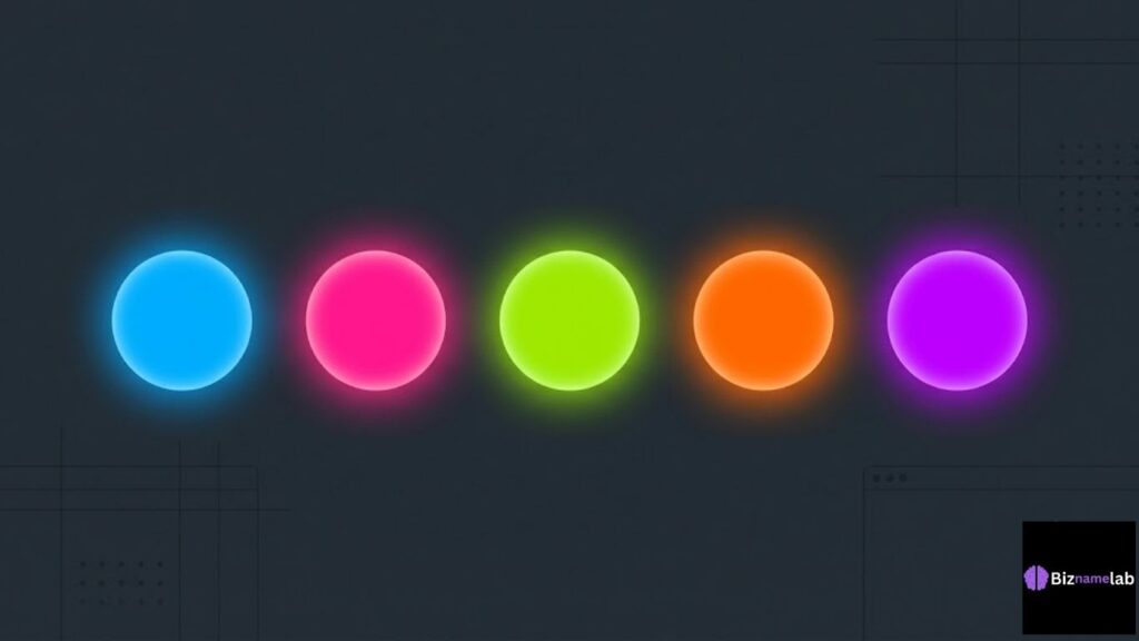
- Electric blue signals technology, trust, and forward motion — common in fintech and SaaS branding.
- Hot pink and magenta communicate boldness, youth, and confidence, popular with beauty and fashion brands.
- Lime and toxic green feel energetic and slightly disruptive, often used by gaming and fitness apps.
- Neon orange pushes urgency and enthusiasm, useful for calls-to-action and limited-time offers.
- Neon purple and violet blend creativity with a futuristic, almost otherworldly feel.
These associations matter because digital branding strategy today is built around split-second decisions. A visitor decides whether a site feels premium, cheap, trustworthy, or exciting before reading a single word. Neon, used deliberately, can push that first impression toward energy and innovation.
The catch is dosage. Psychologically, neon works because it’s rare within a layout. The moment it dominates every element, the brain stops treating it as a signal and starts treating it as noise — which is why accent colors, not full palettes, are the standard approach among professional designers.
How to Use Neon Colors Effectively in UI/UX and Web Design
Neon colors can elevate a product’s user engagement and conversions, but only when they follow a few non-negotiable design rules. Get these wrong, and the same palette that looked stunning in a moodboard becomes unusable on a live site.
The Golden Rule: Use Neons as Accent Colors
Never build an entire interface out of neon tones. Instead, treat them the way a spotlight operator treats light — used sparingly, on the one thing you want noticed. A neon call-to-action button, a glowing icon, or a highlighted stat card pulls the eye exactly where you want it.
The rest of the interface should lean on neutral tones — charcoal, slate, off-white — so the neon color pops instead of competing with itself. This single rule separates amateur neon design from work you’ll see on award-winning software dashboards and SaaS interfaces.
Always Pair Neons with Dark Backgrounds (Dark Mode)
Neon hues were built for darkness. Dark mode aesthetics, with midnight background tones like near-black, deep navy, or charcoal, make neon accents glow the way they do on real neon signage. On a white background, the same colors often look garish or clash with body text.
Dark backgrounds also naturally raise your high contrast ratio, which supports text readability and accessibility. Before shipping any neon-and-dark-mode design, run it through a contrast checker like WebAIM’s Contrast Checker to confirm your text passes WCAG standards.
15+ Trending Neon Color Palettes (With Names and HEX Codes)
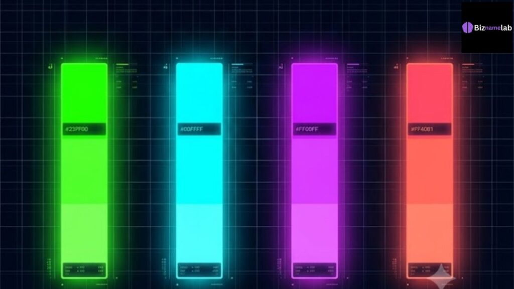
Below are 20 curated neon color palettes, each paired with a dark or neutral base so they’re ready to drop straight into a design system. Every palette lists HEX codes / RGB values so you can implement them immediately in Figma, CSS, or your brand guide.
1. Cyberpunk Billboard (Electric Blue & Hot Pink)
| Role | Color | HEX |
| Primary Accent | Electric Blue | #00F0FF |
| Secondary Accent | Hot Pink | #FF2E9A |
| Background | Deep Black | #0A0A0F |
Perfect for gaming, esports, and tech brands chasing a cyberpunk aesthetic. High energy, high contrast, instantly recognizable.
2. Synthwave Sunset (Neon Orange & Purple Pulse)
| Role | Color | HEX |
| Primary Accent | Neon Orange | #FF6A00 |
| Secondary Accent | Purple Pulse | #B620E0 |
| Background | Midnight Navy | #12081F |
A nostalgic, retro-futuristic palette that channels synthwave vibe aesthetics — great for music, entertainment, and creative portfolios.
3. Hyper Green Energy (Lime Neon & Charcoal)
| Role | Color | HEX |
| Primary Accent | Lime Neon | #C6FF00 |
| Background | Charcoal | #1C1C1C |
Bold, athletic, and hard to ignore. Works well for fitness apps and energy drink branding that wants a jolt of urgency.
4. Digital Fever Dream (Neon Cyan & Orchid)
| Role | Color | HEX |
| Primary Accent | Neon Cyan | #00FFF0 |
| Secondary Accent | Orchid | #DA70FF |
| Background | Space Gray | #16161E |
A dreamy, futuristic pairing well suited to AI products and immersive digital experiences.
5. Miami Vice Reboot (Retro Aqua & Flamingo Pink)
| Role | Color | HEX |
| Primary Accent | Retro Aqua | #2EE6D6 |
| Secondary Accent | Flamingo Pink | #FF5DA2 |
| Background | Deep Teal | #0D2B2B |
A warm-weather, nostalgic combination popular in travel, hospitality, and lifestyle branding.
6. Glitch Mode (Toxic Green & Midnight Violet)
| Role | Color | HEX |
| Primary Accent | Toxic Green | #39FF14 |
| Secondary Accent | Midnight Violet | #2B0B3F |
| Background | Jet Black | #0B0B0B |
An edgy, glitch-art inspired palette suited to streetwear, music labels, and experimental portfolios.
7. Futuristic SaaS Dashboard (Teal Neon & Slate)
| Role | Color | HEX |
| Primary Accent | Teal Neon | #00E5A0 |
| Background | Slate | #1E293B |
Calmer than most entries here, this palette is built specifically for software dashboards and SaaS interfaces where readability matters as much as flair. See our related guide on SaaS color palettes for more product-focused combinations.
8. Arcade Fever (Laser Yellow & Royal Blue)
| Role | Color | HEX |
| Primary Accent | Laser Yellow | #F9F002 |
| Secondary Accent | Royal Blue | #1E3AFF |
| Background | Charcoal Black | #101014 |
A high-energy, retro-arcade palette great for gaming brands, kids’ apps, and playful startups.
9. Y2K Popstar (Neon Peach & Cotton Candy)
| Role | Color | HEX |
| Primary Accent | Neon Peach | #FF9E80 |
| Secondary Accent | Cotton Candy | #FF8CF0 |
| Background | Deep Plum | #200E28 |
A softer neon palette riding the Y2K revival trend, ideal for beauty, fashion, and Gen Z-focused brands.
10. Cosmic Violet Pulse (Deep Amethyst & Bright Violet)
| Role | Color | HEX |
| Primary Accent | Bright Violet | #A020F0 |
| Secondary Accent | Deep Amethyst | #4B0082 |
| Background | Space Black | #0C0714 |
A regal, futuristic combination that works beautifully for creative agencies and AI-driven products.
11. Toxic Candy (Bubblegum Magenta & Acid Yellow)
| Role | Color | HEX |
| Primary Accent | Bubblegum Magenta | #FF00C8 |
| Secondary Accent | Acid Yellow | #E8FF00 |
| Background | Onyx | #121212 |
A loud, playful pairing suited to youth brands, candy and beverage packaging, and event branding.
12. Neon Noir (Ice Blue & Blood Red)
| Role | Color | HEX |
| Primary Accent | Ice Blue | #4DFFFF |
| Secondary Accent | Neon Red | #FF073A |
| Background | Deep Black | #0A0A0A |
A moody, cinematic combination popular in film branding, thriller game UIs, and noir-inspired portfolios.
13. Solar Flare (Neon Tangerine & Deep Indigo)
| Role | Color | HEX |
| Primary Accent | Neon Tangerine | #FF7A00 |
| Secondary Accent | Deep Indigo | #1A0B4D |
A warm, high-energy palette that works well for entertainment platforms and creative event branding.
14. Electric Orchard (Neon Chartreuse & Plum)
| Role | Color | HEX |
| Primary Accent | Neon Chartreuse | #B4FF00 |
| Secondary Accent | Plum | #380B44 |
An unexpected, botanical-meets-tech pairing, ideal for wellness or lifestyle brands wanting a modern edge.
15. Retro Grid (Hot Coral & Electric Indigo)
| Role | Color | HEX |
| Primary Accent | Hot Coral | #FF4D6D |
| Secondary Accent | Electric Indigo | #5D00FF |
| Background | Deep Navy | #0B0E2B |
A synthwave-adjacent palette with a slightly warmer tone, good for creative studios and portfolio sites.
Common Mistakes to Avoid When Designing with Neon Colors
Even experienced designers fall into a few predictable traps when working with fluorescent colors. Avoiding these keeps your brand looking intentional instead of amateurish.
1. Overusing Neon Shades (Causing Eye Strain)
Filling large areas with saturated neon causes real eye strain and visual fatigue, especially on screens. The fix is simple: keep neon confined to 10-20% of the visible layout, reserved for elements that need attention — buttons, icons, highlights.
2. Low Contrast Issues (Ruining Text Readability)
Neon-on-neon or neon-on-white combinations often fail accessibility standards outright. Always check your high contrast ratio against WCAG AA guidelines before shipping, and lean on tools like WebAIM’s contrast checker to verify body text stays legible.
3. Ignoring Print Limitations (RGB vs CMYK)
RGB vs CMYK is a real problem for neon branding. Screens display neon using light (RGB), producing glowing effects that printers simply can’t replicate using ink (CMYK). Expect noticeably duller results on business cards, packaging, or signage, and test print proofs before finalizing brand guidelines.
Key Takeaways
- Neon color palettes work best as accent colors, not full backgrounds.
- Pair neon tones with dark, neutral backgrounds for maximum glow and contrast.
- Color psychology matters: each neon hue carries a distinct emotional signal.
- Always verify text readability with a contrast checker before launch.
- Neon colors look different — and often duller — in CMYK print versus RGB screens.
FAQs
1.What are the most popular neon colors for branding in 2026?
Electric blue, hot pink, lime green, and neon purple remain the most-used neon color palettes across tech, gaming, and lifestyle branding this year.
2.Is neon color good for a website background?
Generally no. Large neon backgrounds hurt text readability and cause eye strain. Neon works best as an accent against a dark or neutral base.
3.How do I make neon colors accessible?
Pair neon accents with dark backgrounds and test every text-and-background combination against WCAG contrast standards using a tool like WebAIM’s Contrast Checker.
4.Do neon colors print well?
Not exactly. Because of the RGB vs CMYK difference, neon shades that glow on screen often look flatter and less saturated in print.
5.What’s the difference between neon and fluorescent colors?
The terms are largely interchangeable in design contexts — both describe ultra-saturated, glowing hues, though “fluorescent” is more common in print and physical materials.
Conclusion: Ready to Make Your Brand Glow?
Neon color palettes can transform a forgettable brand into one people remember instantly — but only when used with restraint, paired with dark backgrounds, and checked for accessibility. Pick two or three palettes from this guide, test them against real content, and let your brand’s accent colors do the heavy lifting.