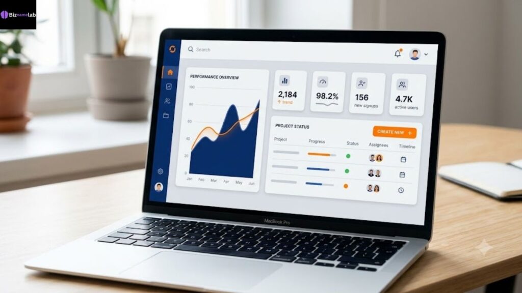
A high-converting SaaS color palette pairs one dominant brand color with a contrasting accent for CTAs, a neutral background, and a readable text color. The best SaaS color palettes balance brand personality with accessibility standards, guiding the eye toward sign-up buttons without causing visual fatigue
Table of Contents
- the-commodity-trap-why-most-saas-brands-keep-returning-to-blue”>The Commodity Trap: Why Most SaaS Brands Keep Returning to Blue
- what-makes-a-good-saas-color-palette-in-2026″>What Makes a Good SaaS Color Palette in 2026?
- the-15-best-saas-color-palettes-for-high-conversions-with-hex-codes”>The 15 Best SaaS Color Palettes for High Conversions (With Hex Codes)
- how-to-choose-your-saas-color-palette-a-step-by-step-color-logic-checklist”>How to Choose Your SaaS Color Palette: A Step-by-Step Color Logic Checklist
- uiux-best-practices-contrast-ratios-and-accessibility-standards-for-tech-platforms”>UI/UX Best Practices: Contrast Ratios and Accessibility Standards for Tech Platforms
- how-to-match-your-software-domain-name-with-your-visual-identity”>How to Match Your Software Domain Name with Your Visual Identity
- 5-critical-landing-page-color-mistakes-that-hurt-software-conversions”>5 Critical Landing Page Color Mistakes That Hurt Software Conversions
- conclusion-build-your-visual-authority-today”>Conclusion: Build Your Visual Authority Today
- faqs-about-saas-color-palettes”>FAQs About SaaS Color Palettes
Introduction
Choosing the right SaaS color palettes is one of the fastest ways to shape how prospects perceive your product before they read a single word of copy. Color shapes perception, triggers emotion, and influences how visitors respond to your pricing page, your onboarding flow, and your CTA buttons. A palette that feels intentional and aligned with your brand personality does more than look good — it builds a consistent path to action that turns casual visitors into engaged users. In this guide, you’ll get 15 ready-to-use palettes with hex codes, plus the exact color logic checklist top SaaS teams use to pick colors that reduce friction and boost click-through rates. Let’s start with why so many software brands default to blue in the first place.
Why SaaS Color Schemes Matter: The Psychology of High-Converting Tech Brands
Color isn’t decoration. It’s information. Before a visitor reads your headline, their brain has already processed your palette and formed a snap judgment about trust, energy, and quality. This is why color triggers emotion faster than any other design element on the page — it bypasses language entirely and speaks straight to the limbic system.
For SaaS companies specifically, this matters more than in almost any other category. You’re selling something intangible — a workflow, a promise, a piece of infrastructure the buyer can’t touch or test-drive in a store. Your visual identity is doing the heavy lifting that a physical product would otherwise do on its own. A well-chosen palette instantly builds credibility, signals that the team behind the product is competent, and helps visitors connect emotionally with users before they’ve read a single feature bullet.
There’s also a functional layer here beyond emotion. Strategic color use creates visual hierarchy — it tells the eye where to look first, second, and third. Done well, this reduce friction in the user journey and helps draw attention to CTAs exactly when the visitor is primed to click. Done poorly, competing colors dilute focus and harm visual flow, and the visitor bounces without ever finding the button you needed them to see.
Finally, consistent color use across your site, product UI, and marketing materials directly impacts how memorable your brand becomes. Color is one of the fastest, cheapest ways to enhance brand recognition — think of how instantly you recognize Slack’s palette versus a generic project management tool. That recognition compounds over time into trust, and trust is what actually converts B2B buyers.
The Commodity Trap: Why Most SaaS Brands Keep Returning to Blue
Open ten SaaS homepages and you’ll likely see the same story: a blue gradient, a white background, and a dark gray headline. Blue feels safe. It signals dependability and calm, and it’s easy to greenlight in a stakeholder meeting because nobody ever got fired for choosing blue. But safe is also the problem — when every competitor uses the same color schemes, your brand blends into the noise instead of standing apart.
This is the commodity trap. Blue isn’t wrong; overusing it without a distinct visual hierarchy or a memorable accent is what dilutes focus and harms visual flow. When your product page looks identical to three competitors’ pages, prospects stop noticing your CTAs and start comparing you purely on price. A palette that connects emotionally with users needs more than a “safe” primary hue — it needs a clear point of view.
Why this matters for conversions:
| Problem with default blue | Effect on the user |
| Overused across the SaaS category | Damages brand recognition |
| Low contrast between shades | Can reduce readability |
| No emotional differentiation | Fails to build emotional connection |
| Predictable visual pattern | Miscommunicates your message as “generic” |
The fix isn’t necessarily abandoning blue — it’s pairing it with a distinctive accent shade, a confident neutral, and enough contrast to guide the eye exactly where you want it. The 15 palettes below show you how.
What Makes a Good SaaS Color Palette in 2026?
A strong SaaS color palette isn’t a random set of pretty colors. It’s a functional system built around conversion rates, usability, and storytelling. Here’s what separates a high-performing palette from a decorative one.
- Purpose and restraint: Every color earns its place. A palette with too many competing hues will compete with each other and look unprofessional or spammy.
- Strategic contrast: Your CTA color should stand apart from the background so it can capture clicks without distraction and draw attention to CTAs immediately.
- Emotional alignment: The palette should match your brand personality — a security tool needs a different emotional tone than a playful project-management app.
- Accessibility standards: Color combinations must meet WCAG contrast minimums so the product remains usable for people with color blindness or low vision.
- Consistency across touchpoints: From your landing page to your in-app dashboard, brand consistency helps enhance brand recognition and keeps the experience feeling intentional and aligned.
- Mobile-first testing: With most SaaS traffic arriving on phones, your palette needs to hold up under mobile responsiveness designs, not just desktop mockups.
Get these fundamentals right, and your landing page design will naturally support usability while it enhances overall user experience — long before you touch copywriting or layout.
The 15 Best SaaS Color Palettes for High Conversions (With Hex Codes)
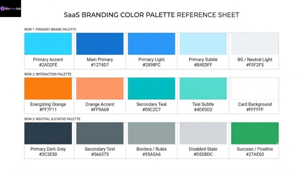
Below are 15 tested color combinations built for different SaaS categories. Each one is designed to create visual harmony and identity while keeping CTAs impossible to miss. Use these as a starting point, then refine with your own A/B testing.
Modern Minimalist (Clean Developer Tools)
Developer tools thrive on a sleek, distraction-free environment where code and data stay the visual focus. This palette leans on near-black text, crisp white space, and a single blue accent that electrifies CTAs without shouting.
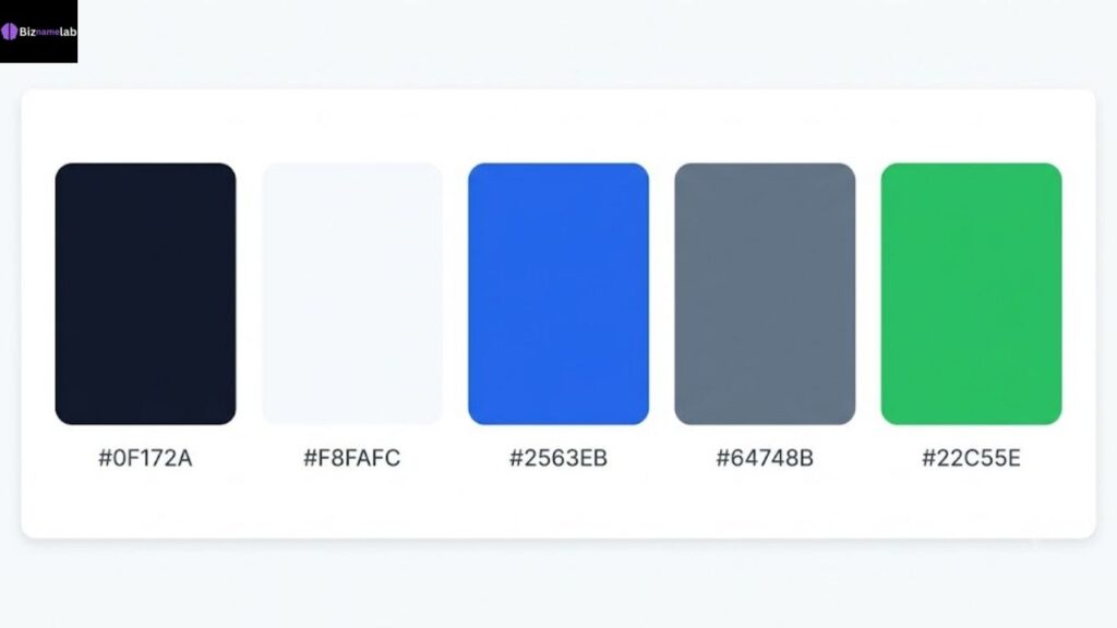
| Role | Color | Hex |
| Primary | Charcoal Black | #0F172A |
| Background | Off-White | #F8FAFC |
| Accent (CTA) | Electric Blue | #2563EB |
| Secondary | Slate Gray | #64748B |
| Success State | Mint Green | #22C55E |
This combination improves content legibility for dense documentation pages and gives engineers the cool, authoritative tone they expect from a technical product.
2. High-Energy Fintech (Trust & Growth)
Financial software needs a palette that instantly builds credibility while still feeling energetic. Deep blue anchors trust, while a vibrant green projects stability and signals growth.
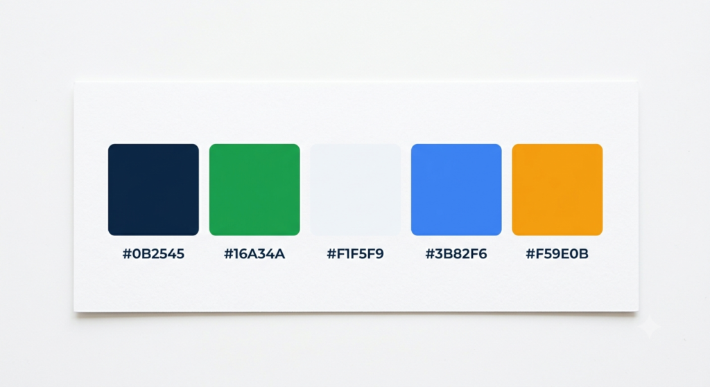
| Role | Color | Hex |
| Primary | Deep Navy | #0B2545 |
| Accent (CTA) | Growth Green | #16A34A |
| Background | Cool White | #F1F5F9 |
| Secondary | Steel Blue | #3B82F6 |
| Warning/Alert | Amber | #F59E0B |
Fintech dashboards using this pairing convey confidence without feeling too aggressive, which matters when users are trusting you with real money.
3. Bold & Dark Mode AI (Futuristic Tech)
AI products benefit from a futuristic, immersive visual experience. Dark backgrounds paired with glowing purple and cyan accents create a cutting-edge, tech-forward feel that suits chat interfaces and model dashboards.
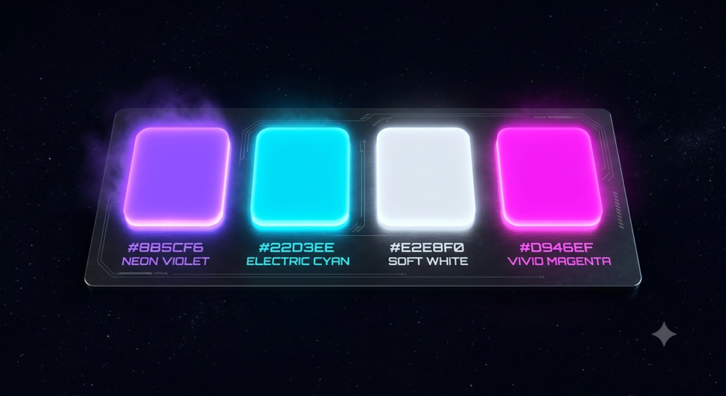
| Role | Color | Hex |
| Background | Deep Space Black | #0A0A0F |
| Primary Accent | Neon Violet | #8B5CF6 |
| Secondary Accent | Electric Cyan | #22D3EE |
| Text | Soft White | #E2E8F0 |
| CTA | Vivid Magenta | #D946EF |
Dark mode UI here does more than look modern — it reduces eye strain during long sessions and gives the product a strong digital punch.
4. Creative & Approachable B2B (Collaboration Platforms)
Collaboration tools need a spark of creativity balanced with professionalism. This palette mixes purple with a warm orange to represent playfulness and energy without losing B2B polish.
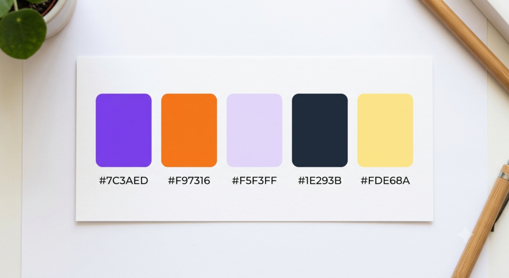
| Role | Color | Hex |
| Primary | Royal Purple | #7C3AED |
| Accent (CTA) | Warm Orange | #F97316 |
| Background | Light Lavender | #F5F3FF |
| Secondary | Charcoal | #1E293B |
| Highlight | Soft Yellow | #FDE68A |
Teams building shared workspaces use this combo to enhance overall user experience while still supporting bold storytelling on the marketing site.
5. Calm & Professional Health-Tech (Clean & Serene)
Health-tech platforms need a palette that radiates clarity and peace. Soft teal and muted blue keep the interface easy on the eyes, which matters when users are managing sensitive health data.
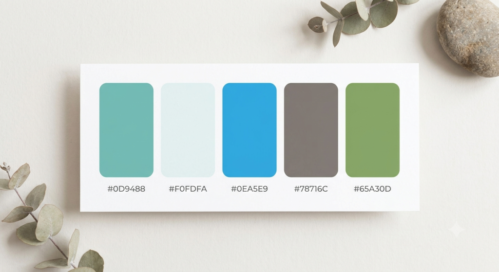
| Role | Color | Hex |
| Primary | Soft Teal | #0D9488 |
| Background | Pale Mist | #F0FDFA |
| Accent (CTA) | Calming Blue | #0EA5E9 |
| Secondary | Warm Gray | #78716C |
| Success | Sage Green | #65A30D |
This palette gives medical software a gentle emotional tone, reducing anxiety for users navigating appointments, results, or billing.
6. Neon & Cyberpunk Edgy (DevOps & Web3)
DevOps and Web3 tools often want street-smart confidence and a palette that demands attention without being overly polished. Black backgrounds with acid-green and hot-pink accents deliver that edge.
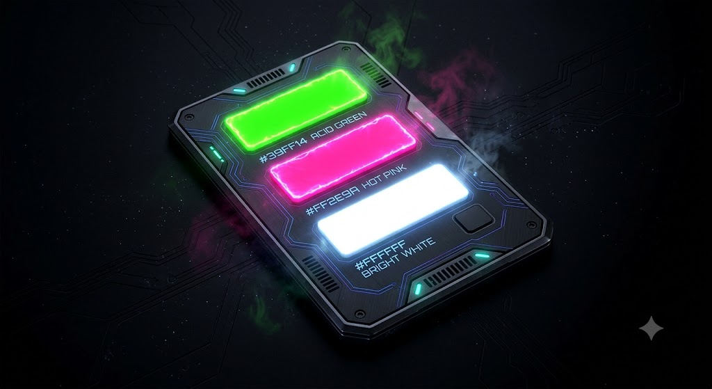
| Role | Color | Hex |
| Background | Jet Black | #000000 |
| Primary Accent | Acid Green | #39FF14 |
| Secondary Accent | Hot Pink | #FF2E9A |
| Text | Bright White | #FFFFFF |
| Muted Panel | Dark Gray | #1A1A1A |
Used sparingly, this combination can grab attention instantly on landing pages targeting developers who want tools that feel rebellious, not corporate.
7. Sophisticated Editorial (Premium Enterprise SaaS)
Enterprise buyers respond to a palette with relaxed sophistication. Navy, cream, and a touch of gold evoke elegance and premium quality, giving the brand a high-end editorial feel.
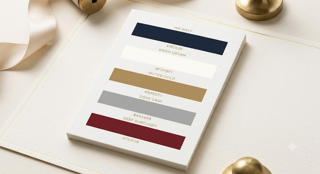
| Role | Color | Hex |
| Primary | Ink Navy | #1B263B |
| Background | Warm Cream | #FDFBF7 |
| Accent | Muted Gold | #B08D57 |
| Secondary | Dove Gray | #A8A8A8 |
| CTA | Deep Burgundy | #7A1F2B |
This graceful palette helps enterprise SaaS project high value to procurement teams who expect a timeless style, not trendy neon.
8. Warm & Inviting HR-Tech (Culture & People)
People-first platforms need colors that feel reliable, personable, and competent. Coral and peach tones spark joy and support a friendly, human tone across onboarding and culture content.
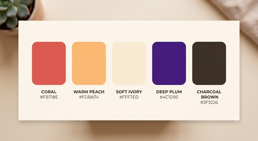
| Role | Color | Hex |
| Primary | Coral | #FB7185 |
| Accent (CTA) | Warm Peach | #FDBA74 |
| Background | Soft Ivory | #FFF7ED |
| Secondary | Deep Plum | #4C1D95 |
| Text | Charcoal Brown | #3F3226 |
HR platforms using this palette report longer page visits, likely because the tone feels less transactional and more like storytelling, authenticity, and community trust.
9. Pastel Harmony (Modern Dashboard UI)
Pastels have become a modern aesthetic appeal staple for dashboard-heavy products. Soft pinks, blues, and lilacs create visual harmony while keeping data panels calm and organized.
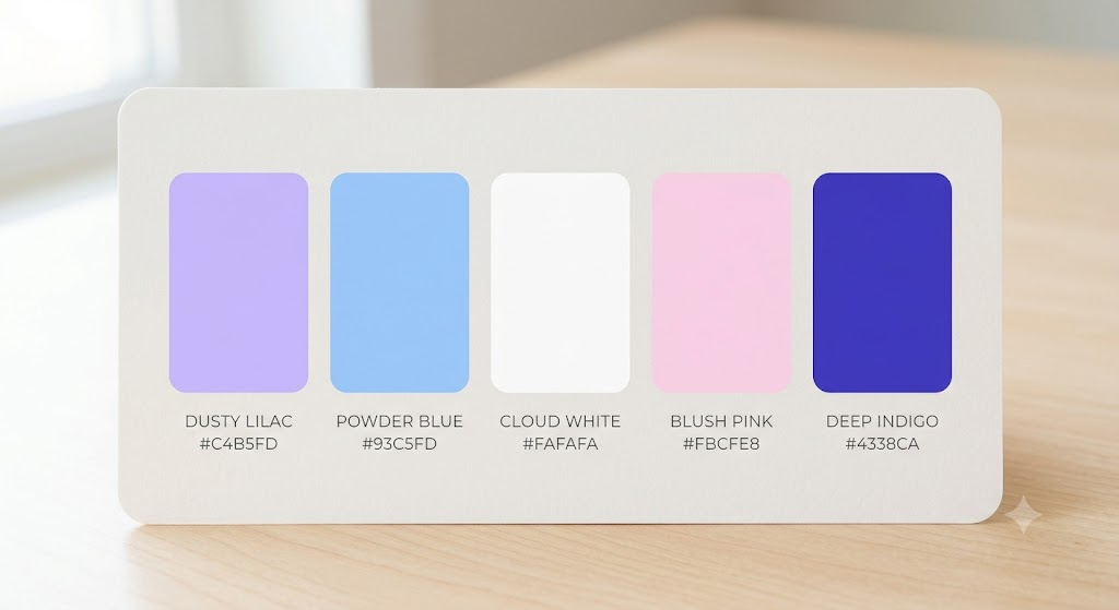
| Role | Color | Hex |
| Primary | Dusty Lilac | #C4B5FD |
| Accent | Powder Blue | #93C5FD |
| Background | Cloud White | #FAFAFA |
| Secondary | Blush Pink | #FBCFE8 |
| CTA | Deep Indigo | #4338CA |
Pastels alone can feel flat, so pairing them with one deep indigo CTA keeps the palette from causing visual fatigue while still driving action.
10. High-Impact Cyber Security (Defense & Shield)
Security software should command attention and project seriousness. Deep charcoal with a sharp red accent conveys urgency and protection without feeling alarmist.
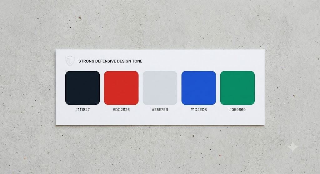
| Role | Color | Hex |
| Primary | Gunmetal Charcoal | #111827 |
| Accent (CTA) | Alert Red | #DC2626 |
| Background | Steel Gray | #E5E7EB |
| Secondary | Cold Blue | #1D4ED8 |
| Success | Shield Green | #059669 |
This palette gives cybersecurity brands credibility and maturity, positioning them as the calm, capable defender rather than the source of panic.
11. Sharp Analytics (Data & Clarity)
Analytics platforms live and die by improve content focus. Cool blues and neutral grays keep charts legible, while a single accent color highlights key metrics.
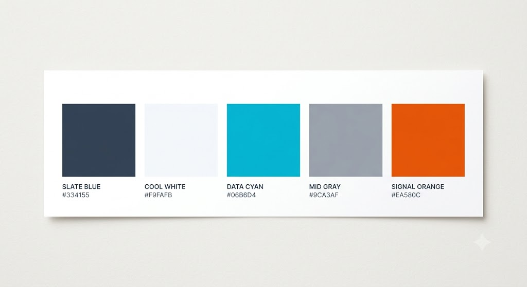
| Role | Color | Hex |
| Primary | Slate Blue | #334155 |
| Background | Cool White | #F9FAFB |
| Accent (CTA) | Data Cyan | #06B6D4 |
| Secondary | Mid Gray | #9CA3AF |
| Highlight | Signal Orange | #EA580C |
The result is a sleek, contemporary presence built for precision, usability, and a sleek digital presence — ideal for BI tools and reporting dashboards.
12. Fresh & Eco Tech (Sustainability Platforms)
Sustainability-focused software should look the part. This earthy palette mixes forest green with sandy neutrals to appeal to eco-conscious users browsing organic product landing pages and climate dashboards.
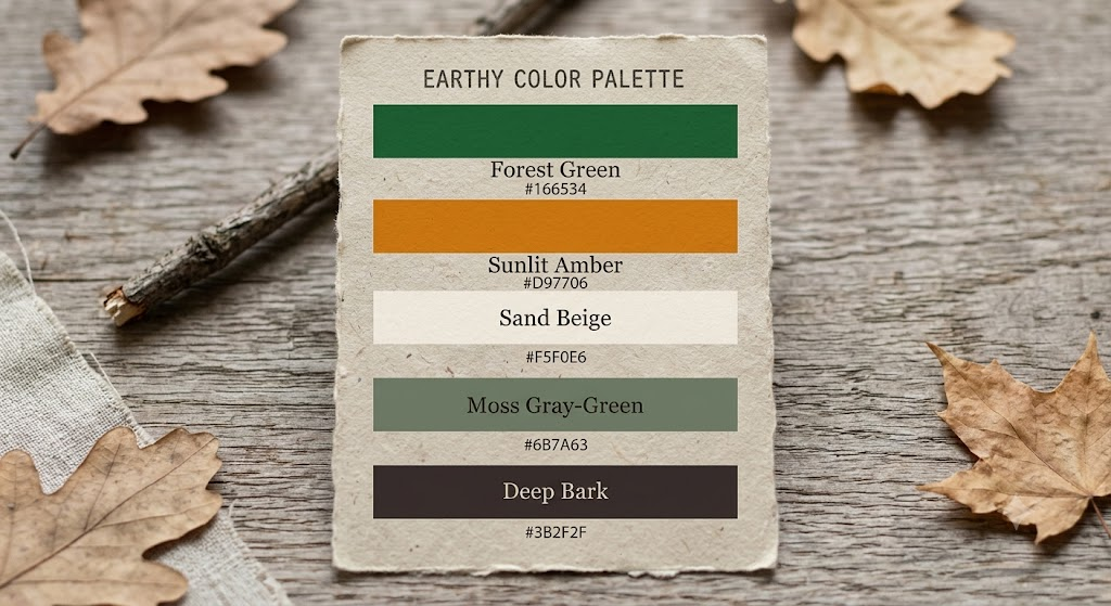
| Role | Color | Hex |
| Primary | Forest Green | #166534 |
| Accent (CTA) | Sunlit Amber | #D97706 |
| Background | Sand Beige | #F5F0E6 |
| Secondary | Moss Gray-Green | #6B7A63 |
| Text | Deep Bark | #3B2F2F |
This combination reinforces authenticity, which matters for platforms whose entire value proposition rests on trust and transparency.
13. Vibrant Marketing Automation (Action & Drive)
Marketing tools should feel upbeat, friendly, and expressive. Orange and red-based palettes are built for pushing action and creating strong visual punches across campaign dashboards.
| Role | Color | Hex |
| Primary | Vivid Orange | #F97316 |
| Accent (CTA) | Hot Coral Red | #EF4444 |
| Background | Warm White | #FFF9F5 |
| Secondary | Deep Purple | #6D28D9 |
| Highlight | Sunshine Yellow | #FACC15 |
This palette is built to drive quick actions, making it a strong fit for tools where every screen ends in a campaign-launch button.
14. Soft Elegance (No-Code Visual Builders)
No-code builders attract creative users who want imagination, individuality, and visual flair. Lavender and blush tones give the product a graceful palette that feels approachable rather than intimidating.
| Role | Color | Hex |
| Primary | Soft Lavender | #A78BFA |
| Accent (CTA) | Blush Rose | #F472B6 |
| Background | Cream White | #FDF4FF |
| Secondary | Muted Plum | #581C87 |
| Text | Deep Slate | #3F3D56 |
The result feels like relaxed sophistication rather than a sterile enterprise tool — a good match for builders targeting freelancers and small teams.
15. The New Neutral (Productivity & Tasks)
Productivity apps increasingly favor understated palettes that don’t compete with the user’s own content. Sage, beige, and charcoal support modern leadership aesthetics and long focus sessions.
| Role | Color | Hex |
| Primary | Warm Charcoal | #292524 |
| Background | Soft Beige | #F5F1EA |
| Accent (CTA) | Sage Green | #84A98C |
| Secondary | Taupe Gray | #A8A29E |
| Highlight | Muted Terracotta | #C97B63 |
This uplifting palette supports calm persuasion — nudging users toward task completion without visual noise.
How to Choose Your SaaS Color Palette: A Step-by-Step Color Logic Checklist
Picking a palette isn’t guesswork when you follow a system. Use this checklist before locking in your final color schemes.
- Define your brand personality first. Are you bold, calm, playful, or authoritative? Your palette should reflect that identity, not just current trends.
- Pick one dominant color. This becomes your primary brand color across the site and product.
- Choose one high-contrast accent for CTAs. This color should appear nowhere else so it can guide user interaction toward sign-ups.
- Add two to three neutrals. Neutrals support text, backgrounds, and borders without competing for attention.
- Test contrast ratios early. Run every pairing through a contrast checker before finalizing anything.
- Check mobile rendering. Colors that look balanced on a large monitor can shift dramatically on smaller screens.
- Validate with real users. Run A/B testing on your CTA color specifically — even small shade changes can move click-through rates.
- Document the system. Save hex codes, usage rules, and spacing guidelines so every future page stays strategically aligned with your conversion goals.
Following this order keeps your palette functional first and beautiful second — which is exactly the priority order that actually improves content legibility and drives sign-ups.
UI/UX Best Practices: Contrast Ratios and Accessibility Standards for Tech Platforms
A palette can look stunning and still fail your users if it doesn’t meet accessibility standards. The Web Content Accessibility Guidelines (WCAG) set clear contrast minimums, and ignoring them can damage brand recognition among the millions of users affected by low vision or color blindness.
Key contrast benchmarks to follow:
- Normal text needs a contrast ratio of at least 4.5:1 against its background.
- Large text (18pt or larger, or 14pt bold) needs at least 3:1.
- UI components and graphics, like button borders and icons, need at least 3:1 against adjacent colors.
- Never rely on color alone to communicate status — pair red error states with an icon or text label too.
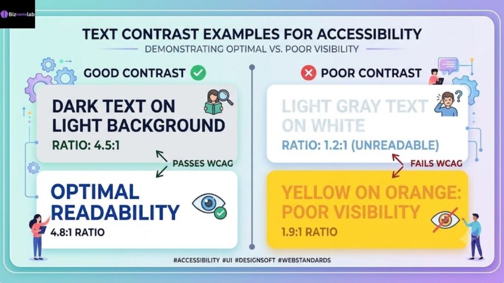
Before publishing any page, run your palette through a dedicated contrast checker such as the WebAIM Contrast Checker and review the official W3C Web Content Accessibility Guidelines for the full standard. This single habit will ensure accessibility, protect you from legal risk, and quietly support usability for every visitor, regardless of ability.
How to Match Your Software Domain Name with Your Visual Identity
Your color palette doesn’t exist in isolation — it should feel like a natural extension of your brand name and domain. A playful, colorful name paired with a rigid corporate-blue palette sends a mixed signal that can miscommunicate your message before a visitor even reaches your homepage.
If you’re still shaping your brand identity, start with the name itself. A structured brainstorm session, like the framework in how to brainstorm business name ideas, helps you land on a name that already hints at your intended tone — technical, warm, bold, or premium — before you choose a single hex code.
For SaaS founders building in specific niches, matching naming and color strategy together strengthens the whole brand system:
- B2B and advisory-style products can pull inspiration from consulting name ideas that pair naturally with the sophisticated editorial palette above.
- AI-driven and technical platforms often align best with the bold dark mode palette when paired with names from this list of tech and AI company name ideas.
When your name and palette feel intentional and aligned, the entire brand becomes easier to remember — and easier to trust.
5 Critical Landing Page Color Mistakes That Hurt Software Conversions
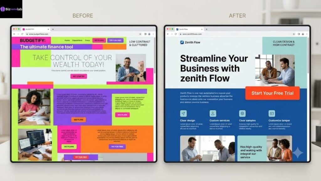
Even a well-chosen palette can underperform if it’s applied poorly. Watch for these five mistakes.
- Too many CTA colors on one page. When every button uses a different shade, none of them draw attention to CTAs effectively, and visitors lose the intended path to action.
- Low contrast between text and background. This is a fast way to reduce readability and push visitors away before they finish reading your pitch.
- Ignoring color psychology for your category. A cybersecurity brand using soft pastels, or a wellness app using aggressive neon, sends the wrong emotional signal.
- Skipping mobile testing. A palette that works on desktop can break down under real mobile responsiveness designs, especially with gradients and low-contrast overlays.
- Changing palettes without testing. Swapping brand colors on a whim, without A/B testing, risks losing the brand consistency that built trust with returning users.
Avoiding these mistakes protects the seamless, emotionally resonant experience your palette was designed to create in the first place.
Conclusion: Build Your Visual Authority Today
Your SaaS color palette is one of the highest-leverage design decisions you’ll make — it shapes trust, guides clicks, and separates your product from the sea of look-alike blue dashboards. Use the 15 palettes above as a starting framework, apply the color logic checklist, and test relentlessly against real conversion rates. Small, intentional color choices compound into a critical part of visual storytelling that keeps users coming back.
Key Takeaways
- Overusing default blue can damage brand recognition — differentiate with a distinct accent color.
- A good palette balances brand personality, contrast, and accessibility standards.
- Each of the 15 palettes above is matched to a specific SaaS category, from fintech to no-code tools.
- Always validate contrast ratios with a contrast checker before launch.
- Match your visual identity to your brand name for a more seamless, emotionally resonant experience.
- Avoid common mistakes like multiple CTA colors, low contrast, and untested mobile rendering.
FAQs About SaaS Color Palettes
H4: How many colors should I use on a SaaS landing page?
Most high-converting pages use a 60-30-10 split: one dominant neutral (60%), one primary brand color (30%), and one accent color reserved for CTAs (10%). Sticking to this ratio keeps your visual hierarchy clean and prevents colors from competing with each other.
H4: What is the best high-converting color for CTA buttons?
There’s no single universal winner — what matters most is contrast against the surrounding background, not the specific hue. Orange, green, and red all perform well because they grab attention instantly, but the real driver of click-through rates is how sharply the CTA color stands out from everything around it.
H4: Why are pastel color palettes trending for modern SaaS platforms?
Pastels support a modern aesthetic appeal while keeping data-dense dashboards calm and approachable. As more SaaS products compete on user experience rather than raw features, softer palettes help reduce friction and make daily use feel less clinical.
H4: How does color psychology directly impact software sign-ups?
Color influences how visitors respond on an emotional level before they process any copy. A trustworthy blue-green combination can instantly build credibility for a fintech tool, while a vibrant orange CTA can drive quick actions on a marketing platform — the right psychological match reduces hesitation at the point of conversion.